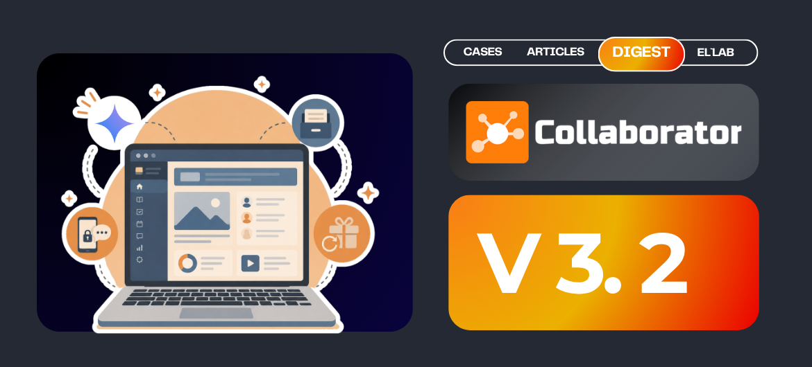
LMS Collaborator 3.2 – Task Archive, Integration with Google Gemini, and a Redesigned “Resource list” Page
Some people update their wardrobes for summer, but we’re continuing to revamp the platform’s design.
But it’s not just about the visuals!
This time, we’ve focused on improving features designed to make administrators’ jobs easier, such as creating a task archive, integrating with Google Gemini, changing passwords via phone number, and the ability to reset all bonuses in just a few clicks.
In short, please welcome LMS Collaborator 3.2.
1. Task archive
We know from experience that, over time, a considerable number of tasks with strict deadlines pile up. And now these performance reviews—which employees were supposed to complete between May 1 and May 5, way back in 2019 — are not only an eyesore but are also getting in the way of our work in 2026.
There are more and more of them every day. All the reports from there have long since been collected, but you can’t delete these tasks because the workers’ training history would simply be erased.
Sounds familiar, doesn’t it?

That’s why we’ve added an “Archive” tab in our new version, where you can move tasks that are no longer relevant so they don’t get in the way.
The process is simple and requires just a few clicks. For a single task, simply select it from the list and click the “Archive” button. If there are multiple tasks, you can archive them all at once using the bulk action feature. After that, the tasks will disappear from this tab, but they won’t be lost.
If you go to the archive, you’ll find them there. You can still view their reports and logs of sent notifications, as well as restore or delete them, but these tasks cannot be assigned, edited, or used in automation plans, nor do they appear in the calendar, training catalog, or individual development plan.
If we need to do something with them, we first restore them from the archive, and only then perform the necessary actions.
By default, archived tasks are not visible to users. For those who wish to make them visible, we have provided an additional option located on the Policies page under “Tasks.” Simply enable the “Show the user tasks that have been moved to the archive” feature so that they can view them.
2. Integration with Gemini
It seems the world has now split into two camps: those who prefer ChatGPT, and those who rely exclusively on Google Gemini for their daily tasks. As for us, the LMS Collaborator team, despite having our own personal AI favorites, is doing everything we can to ensure you don’t have to compromise and can create your learning materials using your preferred provider.
So now, in addition to ChatGPT and Amazon Bedrock, our platform also offers seamless integration with Gemini. Simply select the service from the list, specify the desired model and API token to connect. After that, everything works exactly the same way as with other AI providers.
Improve your texts, find images to go with them, and generate questions for quizzes and surveys — all in just a few minutes!
3. Redesign of the “Resource list” page
3.1. Migrating the feature for adding resources to categories via a bulk action to the new design
First and foremost, it’s important to understand that by “design update” we don’t just mean replacing icons (although, admittedly, that was done as well), but simplifying the overall logic of how the system works.
For example, how much time do you spend searching for the resources you need?
When there are a lot of them, even a simple task like this can take more than an hour. With the bulk move feature, you can select multiple resources at once and move them to the category of your choice.
3.2. Migration of the resource creation page to the new design
With each new version, more and more system elements are gradually being updated to the new design. This time, it’s the resource creation page’s turn. First, just like when creating a task, a list of resource types pops up. Select the one you need, and you’ll be taken directly to the page for creating that resource.
- “Page” resource
First, click “Add” and select “Page.” Then, enter the title and description of the resource, click the dropdown menu, select its type from the list, and check the categories to which it belongs. Next, if you want it to appear in the knowledge base, click the “Access” tab and select, for example, the “Available to everyone” option.
The same applies to tags.
We now have a separate modal window for selecting authors and co-authors. Upload the resource cover and the image for the task card, and attach the necessary files. And finally, save your new page.
- “Adaptive page” resource
Here, the functionality is almost the same, but with access to a separate editor offering additional settings. It’s simple: just click the “Edit” button, fill in the content, and save your changes.
- “File” resource
The process for creating this resource is the same as for the previous ones, with one difference: the inclusion of a file upload section. The system will prompt you with the formats you can upload.
Let’s say we want to upload a PDF. If needed, you can immediately convert it into a “Presentation” resource. If there’s no need for that, we’ll save it as a separate file for download.
There is a wide variety of formats available to you.
If you upload a JPEG or PNG image, it will be displayed as a picture when viewed. In the case of spreadsheets or documents, they will appear as downloadable files. As for audio files, they have their own built-in players for playback.
If you have unsaved changes on this page—or any other page with the new design — the system will always ask you if you’re sure you want to log out, so you don’t accidentally lose all your previous work.
- “Video” resource
Here, the process is almost the same as with files. The platform has two separate sections for uploading the video itself and its subtitles. From there, you can select additional options, such as allowing downloads, automatically playing the video upon opening, or displaying it in the info box on the guest page — and, of course, uploading a cover image.
- “Link” resource
This section is pretty straightforward. Select the source, paste the link to it, set the frame height, and, if you like, choose to open it in a new window. Done — just save it.
- “HTML-file” resource
First, we need to select the ZIP archive from which the HTML will be extracted. Next, we choose the source file and save the changes. Options for adjusting the frame height and opening the file in a new window are also available.
- “SCORM” resource
The steps for creating it are almost identical to those for an HTML file, with the sole difference being the ability to award a 100% score upon completion of the course. All other settings are already familiar to us from previous resources.
- “Gallery” resource
Sometimes a single image isn’t enough for training—you need several. That’s exactly why we’ve included an option for a gallery of uploaded images, which can be viewed and scrolled through using a special player.
What’s new here compared to the old design?
The first and last slides are now marked separately. When you hover over them, you can delete either one or reorder them in the view. Another feature is the option to automatically play the images when the file is opened.
- “Presentation” resource
If we open the old design, we’ll see that we didn’t have this option in the resources before. Now, however, you don’t need to click anything extra or convert anything, because the system does it all automatically.
3.3. Migration of the survey creation page to the new design
If you’ve already created quizzes using the new design, you’ll notice a lot of similarities. So, let’s go to the “Surveys” section, click “Add,” and we’ll be taken to the page where we’ll build it.
Here we have a title, a section for introductory information, and two main sections: “Questions” and “Description and settings.” In the latter, we can briefly outline the requirements, upload the necessary files or images for the task card.
As for additional options, you can set the survey to be confidential, display the results to all participants, or make it anonymous. All of these features have been moved and are now located under the “Settings” button.
When it comes to adding questions to the survey, the platform offers the following four types:
- A single-choice question, where you can select only one answer. You can set the number of options yourself, as the platform does not impose any restrictions in this regard.
- A question with more than one answer, where students select multiple options instead of just one. Out of five options, the user can choose just two or all five—it’s up to you.
- An open-ended question where the employee fills in the text field on their own, with the option to attach a file if necessary.
- Questions on a scale, for example, from one to ten. Additionally, you can add an option to comment on the answer if the selected rating is less than or equal to a certain value.
You can easily find any question by filtering by text, number, type, or group name.
By the way, regarding the last point. We currently offer two ways to take the survey. In the standard scenario, all you need to do is answer all the questions from start to finish.
Another option is to divide participants into groups. This approach is used, for example, when an employee indicates that they lack the skills to use a particular tool. In that case, the survey ends, and the employee is automatically moved from the first group to the third, skipping the second group due to a lack of relevant experience.
4. Hints for the test questions
The quiz section has also been updated. You can now add a hint to any question to make the learning process easier for students and help them recall the material on their own, rather than just guessing the correct answer. Users will see a “Show hint” button, so they can decide for themselves whether they need help or not.
5. Tips for administrators regarding changes to the test report
Let’s say we have a test that was added way back in the Stone Age, which hundreds of employees have already taken. But some time has passed, and some of the answers are no longer relevant. An administrator can easily replace them with the correct ones, but the problem is that no one but the administrator will remember to do so.
And then the administrator leaves the company, and a new person takes their place. This person looks at the log and doesn’t understand why the system marked the user’s incorrect answer as correct. To prevent such situations from occurring, we’ve added a note indicating that the correct answer has been changed.
The same applies to removing questions from the test. Previously, they simply weren’t displayed. Now, we keep them for the record, but indicate that the questions have been removed from the test.
If desired, the administrator can also update the results with a single click after making changes, and a separate note will be saved to indicate this.
6. The option to reset all bonuses
You asked for it — we delivered! Whereas previously we had the option to remove bonuses for a specific employee, in the new version you can click the “Reset” button to clear all user bonuses and start them from scratch—for example, at the beginning of the new year. At the same time, this action will also clear the entries from the accrual and expense logs. But keep in mind that it will be impossible to undo this action.
7. Adding comments to gifted bonuses
The option to “Give users bonuses” that they can gift to others is still there. What has changed is the ability to add comments to these virtual gifts so that recipients know exactly what they were awarded for.
8. Co-facilitation of one-on-one meetings
One type of task in the development plan is a one-on-one meeting. In the old version, we could only assign a single supervisor to it, who was essentially the only person responsible for it. Now, however, there is an option to “Add a co-supervisor” with the same permissions. This means that each of them will see the same set of fields and functions.
And even though the request was for only two curators, we decided not to limit you, so there can be five or twenty-five, if that’s what you need.
9. Optional grading for meetups
In the previous version, we had only one option for selecting the result type: a grade. In Collaborator 3.2, we’ve added another option that will be the default: attendance. In this case, a session is considered 100% complete if the employee simply attended it. If they were absent, they’ll receive 0% and a “Failed” status.
10. Password recovery via phone number
If we were to rank the most popular buttons in the system, “Forgot password” would take the top spot by a wide margin. When a user clicks it, they are redirected to a page where the system asks them to enter an email address — to which recovery instructions will be sent — and to complete a CAPTCHA, that is, to confirm that the request is coming from a human.
We didn’t have any other options… until now! Now we can go to the platform settings, select the “Policies” menu item, and enable phone number-based recovery in the “Passwords” tab. However, it’s important to note that the phone number must already be on file in the user’s contact information; otherwise, the request simply won’t go through.
11. Permission to register virtual email addresses
To add them, we went to the “Notifications” tab, selected the “Virtual mail domains” option, and saved the domains that the system should ignore in the future so that emails don’t end up in spam. Now you have this option too.
12. Exporting a summary report of questionnaires by assessment
When we go to the page for creating and viewing a profile, there is an option to download an Assessment report. This is detailed data showing how each user responded. And while we used to have to visit each page individually, download the reports, and then manually compile them, in Collaborator 3.2 we can download a consolidated report for all surveys with just one click.
13. Editor for the criteria description field
The era of standard formatting for assessment criteria descriptions has officially come to an end! From now on, thanks to the built-in editor, you can underline text, change fonts, add bulleted lists, center headings, highlight key points with color, and more.
 14. Refactoring comments from “Criteria-based assessment”
But that’s not the only update to the evaluation criteria section. For your convenience, we’ve also revamped the layout of the comments. They are now displayed within a clear hierarchy: first, you see the groups; then, each individual criterion; and within those, a breakdown into clusters.
15. Assigning people to be responsible for subtasks
Carrying out any project is a team effort, where each employee has their own area of responsibility. To make it clear who is responsible for what, we’ve added the ability to assign people not only to tasks but also to specific subtasks.
And finally, the last important piece of news — which our developers really, really wanted us to share — is that after the release of Collaborator 3.3, there will no longer be a button to switch back to the old design. No pressure, but why would you even need it when there’s such a convenient new version, right?
Read about the previous version of LMS Collaborator 3.0 here