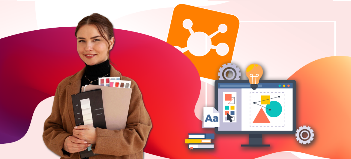
Aesthetics of learning: 5 secrets of learning portal design
Have you ever noticed how design can “speak”?
How the right color, shape, and layout can turn an ordinary page into a real learning guide.
The design of a learning portal is more than just a decoration. It is a powerful communication and learning tool. It combines psychology, aesthetics, and functionality. It turns complex information into easy-to-understand information, technical materials into interesting and understandable ones, and the learning process into a truly exciting journey of knowledge.
When every element of the interface works in harmony – from the color palette to the logical arrangement of menus – the portal becomes not just a tool, but a guide that leads the user through the most interesting learning routes.
In this article, we’ll share life hacks and practical tips to help you create an interface that motivates, inspires, and makes the learning process as comfortable as possible.
Basic principles of learning portal design
 1. Simplicity and convenience.
An interface overloaded with elements distracts from the main thing – learning. Instead, clean lines, enough “air” between elements, and a clear structure help users quickly navigate the system.
2. Adaptability to different devices.
Employees can access the platform from different devices: a laptop, smartphone, or tablet. It is important that the learning portal is displayed correctly on all devices. The design should be flexible, meaning that elements should adapt to the screen size without losing functionality.
3. Visual hierarchy.
To make it easy for employees to perceive information, it is important to place accents through fonts, colors, and block placement. Important information should be striking, and secondary details should not overload the space.
4. Branding.
Adapting the platform to the corporate style creates a sense of a single information space for the company. This increases employee loyalty and the perception of training as an integrated part of corporate culture.
Common mistakes in the design of a learning portal or what to avoid
Oksana Ivanova – UI/UX Designer LMS Collaborator
«The design of a learning portal is not just about aesthetics, but primarily about functionality and user comfort. By working on the right design, you will get a powerful tool for attracting and retaining users.
The most common places of “pain”:
1. Color scheme and availability:
The balanced use of corporate colors (not “let’s paint everything in corporate bright yellow because it’s so positive!”).
Ensuring sufficient contrast for readability (not playing “find me if you can”).
Compliance with the principles of Accessibility for different user groups.
Avoid bright, eye-tiring color schemes (no, a neon pink background will not help you remember the material better).2. Balance of elements:
A clear delineation of functional areas (not “squeeze in this, and this, and this, and a little bit is okay too”).
The optimal ratio of text and visual elements.
Avoiding information overload on covers and previews.
Preserving the “air” between the elements (users need to breathe too!).3. Hierarchy and navigation:
Thoughtful content structure.
Intuitive navigation system.
Visual markers to indicate the importance of information (because not everything that flashes is really important).
Logical grouping of related elements.4. Customization:
Flexible interface customization tools.
Possibility of adaptation to the corporate style.
Integration of branded elements and characters.
Maintaining overall usability.Our development team strives to create a balanced system where each element fulfills its role without interfering with the others. We give you the opportunity to customize the portal for yourself, but we do not recommend turning it into a bizarre work of modern art.
A good design is when the user doesn’t even notice how comfortable it is to work. And bad design is when everyone is discussing how “creative” it is.
P.S. All coincidences with real portals are random, but errors are quite typical!»
How to design a learning portal: Key elements of effective design
1. Guest page of the portal
Employee interaction with the learning portal begins with the login page. This is the first impression that shapes the further attitude towards the entire platform, so pay special attention to its design.
The key elements of an effective guest page:
- The authorization form – should be noticeable but not cumbersome. The best option is a clearly designed login/password field with a minimum of additional elements.
- Information block – add a company logo, a short welcome text, or a motivating message here. This will help to immediately immerse employees in the corporate culture and create a sense of unity with the team.
- Interactive elements – such as video greetings from management, animated elements, or interactive infographics can significantly increase engagement from the first seconds.
- Brief instructions – if specific actions are required to log in, add short prompts, but do not overload the interface with them.
❌Avoid common mistakes:
🚫Overloading with information. The login page should be simple and clear. Excessive text distracts and complicates the login process.
🚫Complex authorization forms with many fields. Multiple fields or unnecessary registration steps can put users off.
🚫No feedback in case of an unsuccessful login attempt. If an incorrect password is entered, the user should receive a clear error message and a hint on what to do next.
In LMS Collaborator, you can customize the guest page in accordance with your corporate brand book. Add your logo, text, images, or other interactive elements to the information block. For example, a video welcome or other important message.
Examples of guest page design
2. Home page
The home page is where employees start their learning journey. It should be intuitive, informative, and help users quickly find the sections they need.
Elements that can be added to the home page:
- Personalized dashboard – a list of assigned tasks, displaying learning progress.
- Information widgets – compact blocks with up-to-date information, for example, a calendar of events, new courses, and academic performance.
- Announcements and news – a block with important messages from the portal administration.
- Quick access – laconic icons or buttons to get to the most frequently used sections.
Location recommendations:
📌The most important elements are at the top of the page. A personalized dashboard, widgets with courses, and ads should be immediately visible without the need for scrolling.
📌Logical grouping of elements. For example, all blocks related to the educational process (courses, assignments, rating) should be placed side by side, and news and announcements should be in a separate block.
📌Responsive design. The home page should be displayed correctly both on large screens and mobile devices. You should avoid complex layouts that may look bad on smartphones.
The home page is the first thing employees see when they enter the LMS Collaborator learning portal. Here you can post important announcements or news. You can also change the location of the blocks separately for each role, add buttons-links to important sections of the portal, pages, etc. For example, to the corporate wiki, organizational structure, main resources of the Knowledge Base, forum, chat, etc.
Examples of home page design
3. Design of learning materials
The design of learning materials plays a key role in the perception of content. Visually appealing and well-structured material is easier to digest, motivates learning, and keeps users’ attention.
Basic principles of designing educational materials:
- Content visualization – long textual materials are harder to read. Use infographics, diagrams, illustrations, and videos to improve the presentation of information and make it more understandable.
- Card design – be sure to add images to your learning task cards. This will make the material more attractive and help you quickly navigate the content.
- Uniform style of illustrations – stick to one style of illustrations (minimalistic, realistic, flat design, etc.). This creates a sense of cohesion and makes the portal look more professional.
- Structured content – break down the material into small, easily digestible blocks. Use headings, lists, and key points to help employees find the information they need quickly.
Practical advice:
📌Create a library of standard illustrations for different types of content.
📌Use icons to indicate the type of content (video, quiz, article, etc.).
📌Display the approximate time of the material, if possible.
📌Leave enough “air” in the design – do not overload the page with elements, maintain a balance between text and visuals.
Examples of task cards design
4. Gamification elements
Properly designed game elements make learning more engaging, encourage active participation, and create healthy competition.
Design features of gamification elements:
- Badges and awards – follow a consistent style for badges. Use the same approach to colors, shapes and graphic elements. Avoid using chaotic images that destroy visual coherence.
An example of Akvantis badge design
- Rankings and leaderboards – use clear, contrasting visualizations of rankings. Add user avatars or photos to personalize the experience.
- Virtual currency and gift shop – if you use a virtual rewards system, be sure to add high-quality images to each gift in the store. Use realistic or stylized icons that match the overall style of the portal.
An example of OKKO gift shop design
Recommendations for implementation:
🎯Make gamification unobtrusive. It should complement learning, not distract from it.
🎯Maintain visual consistency. The design of badges, rating tables, and virtual awards should match the style of the entire portal.
🎯Optimize your design for different devices. Make sure gamification elements look good on both large screens and smartphones.
In LMS Collaborator, you can use different types of gamification to motivate your employees. There are badges and certificates for successful completion of training, a rating to stimulate healthy competition, and a gift shop where users can exchange virtual points for real rewards.
Try LMS Collaborator and set up your own motivation system today.
5. Other sections of the portal
In addition to the main pages, the learning portal contains other sections that also require attention to design and easy navigation. Their structure and layout determine the effectiveness of user interaction with the platform.
Key design elements:
- News and announcements – use high-quality, relevant images for each news item, following a consistent format and style.
Example of news design
- Knowledge base – structure your content through a system of tags, categories, and subcategories so that users can easily find the information they need.
An example of the Kernel Knowledge Base design
- Access levels – clearly differentiate content for different categories of users so that they understand what they have access to and what they don’t.
- Forums and discussions – create a logical and intuitive structure of threads.
An example of forum management
Important points:
📌 Use accents (icons, colors, highlighting) to draw attention to news, updates, or important messages.
📌 Use the same fonts, colors, design styles in all sections of the portal.
📌 Provide a convenient search in all sections of the portal.
Conclusion
A good design of a learning portal is not just about aesthetics, but about convenience, efficiency, and user engagement. An intuitive interface, adaptability, and well-thought-out structure make the learning process more comfortable and effective.
Adherence to the principles of UX design, a clear visual hierarchy, and compliance with the corporate style will help create a platform that will become a real learning assistant.
At LMS Collaborator, we understand that every company is unique, and that’s why we offer maximum flexibility of the platform to customize it to any needs of your business. Our LMS is not just a tool, but a designer where you can:
- Fully adapt the design to the corporate style of the company.
- Design the interface taking into account the characteristics of your team.
- Customize modules and functionality to the specifics of your educational process.
- Add unique gamification elements.
- Get support from experts with years of experience in corporate e-learning.